July 10, 2023
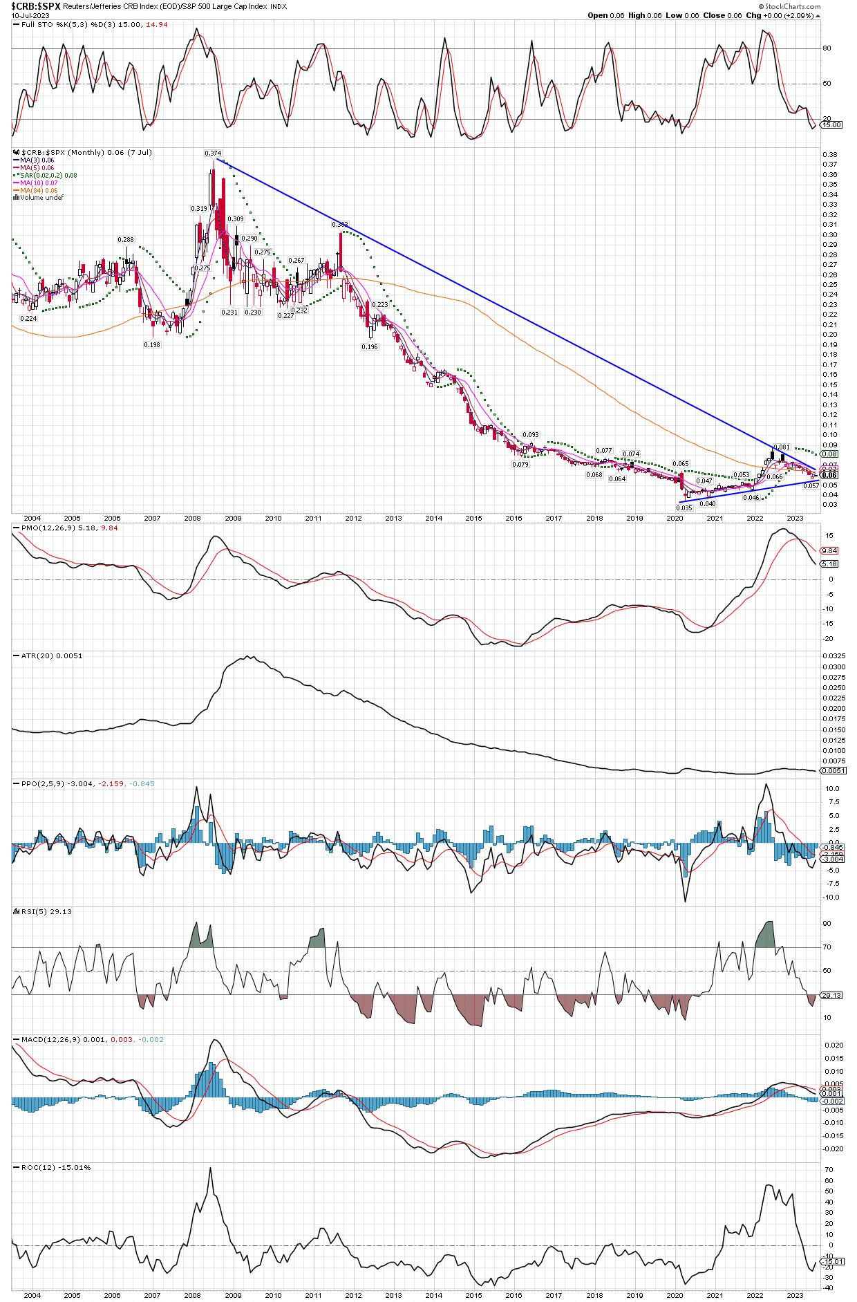
Here is a monthly chart of the $CRB commodity index vs. the $SPX S&P500 index, going back twenty years. Two things to note, first is that the big run higher with inflation from 2021 is hardly a blip on the chart. The second thing that jumps out at me is how much potential upside commodities have, after what appear to be just the first leg of a new commodity bull. Once the ratio gets over the downtrend line, commodities could rocket higher. The ratios stayed in a range from 2003 (as far as this chart can go back) until it broker lower in 2012, at a level OVER 3x higher than where it sits today! Just getting back to that area would be a bull market to behold in commodities and the stocks of companies that produce them. I maintain that we haven’t seen anything yet, and nothing like what we will see over the next several years.