FOMC Raised Rates Another .75%

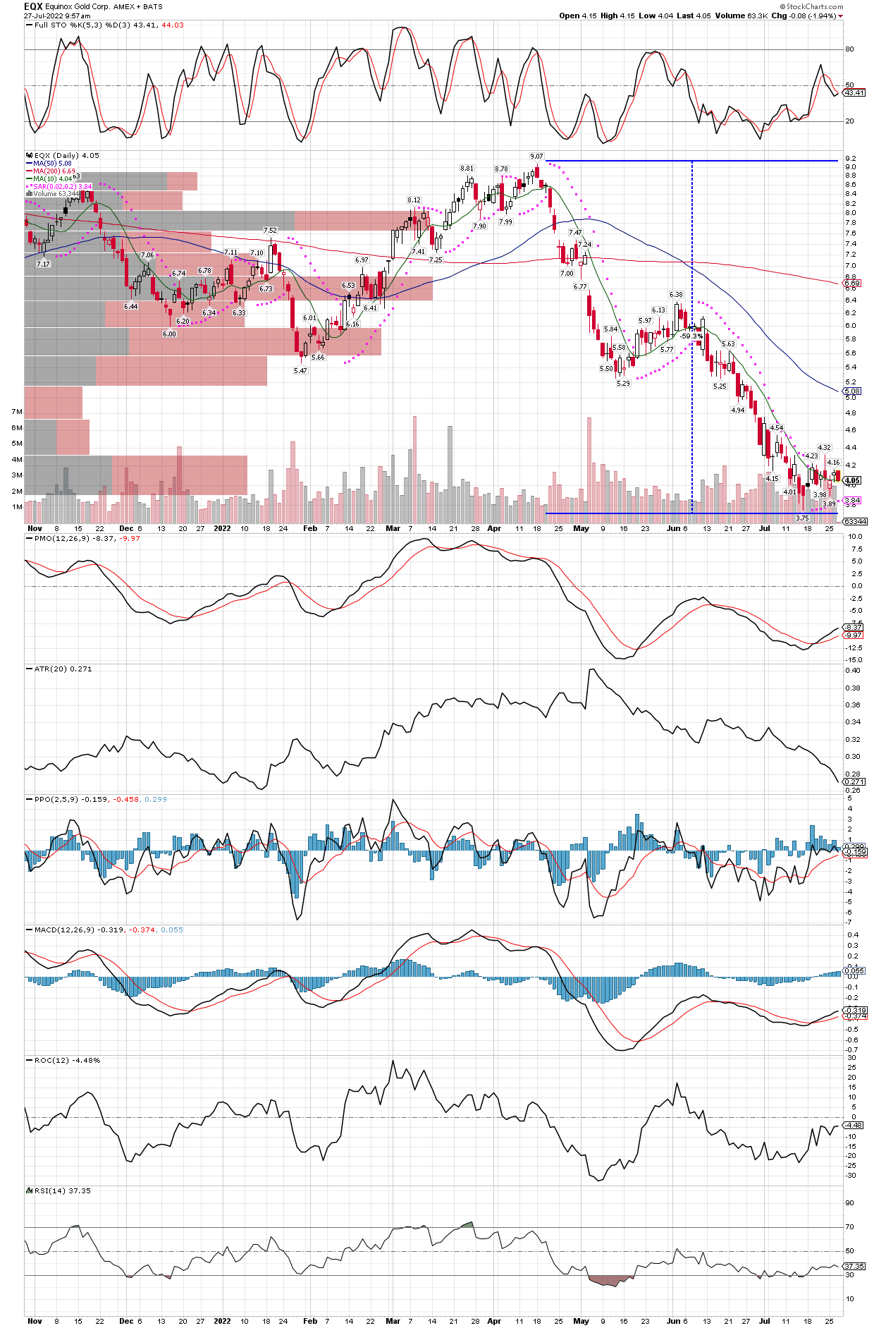
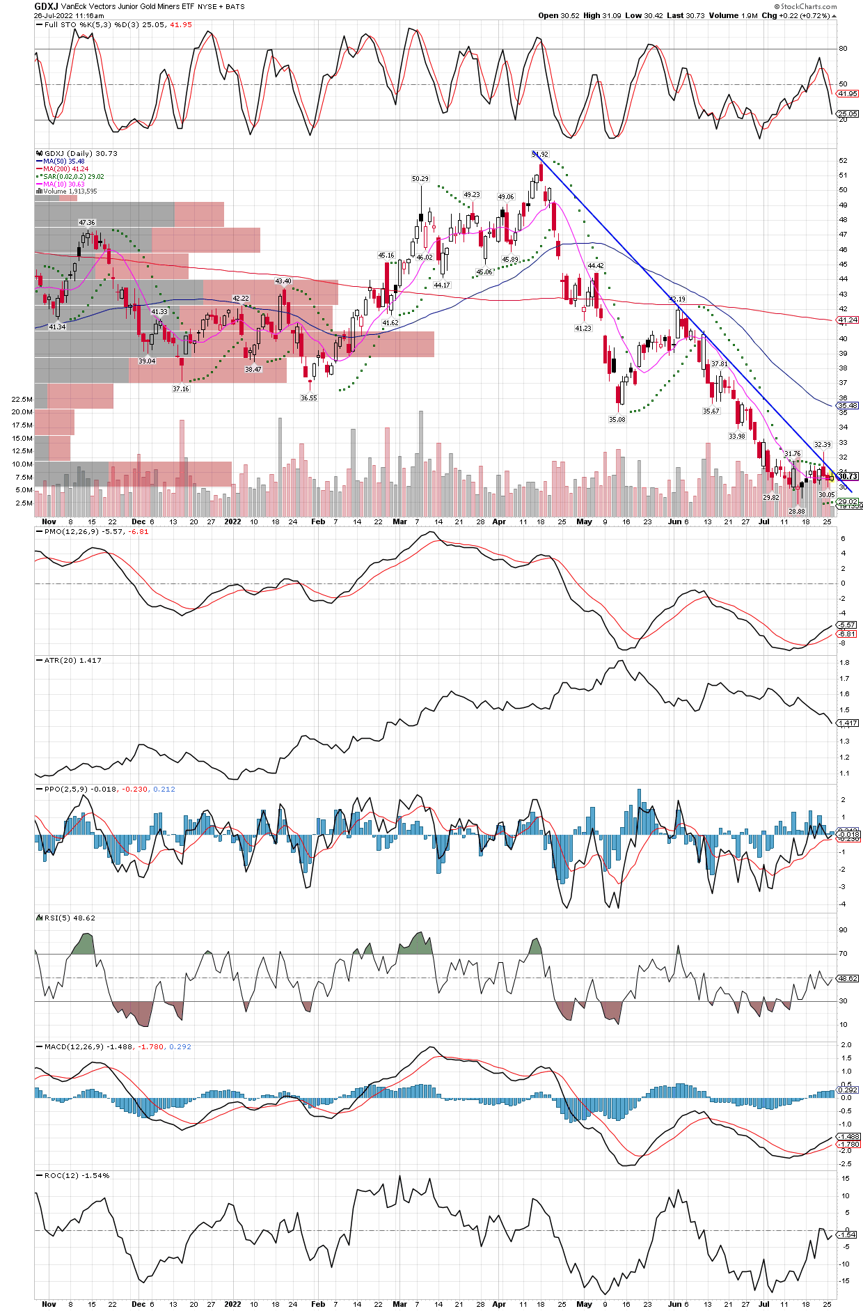
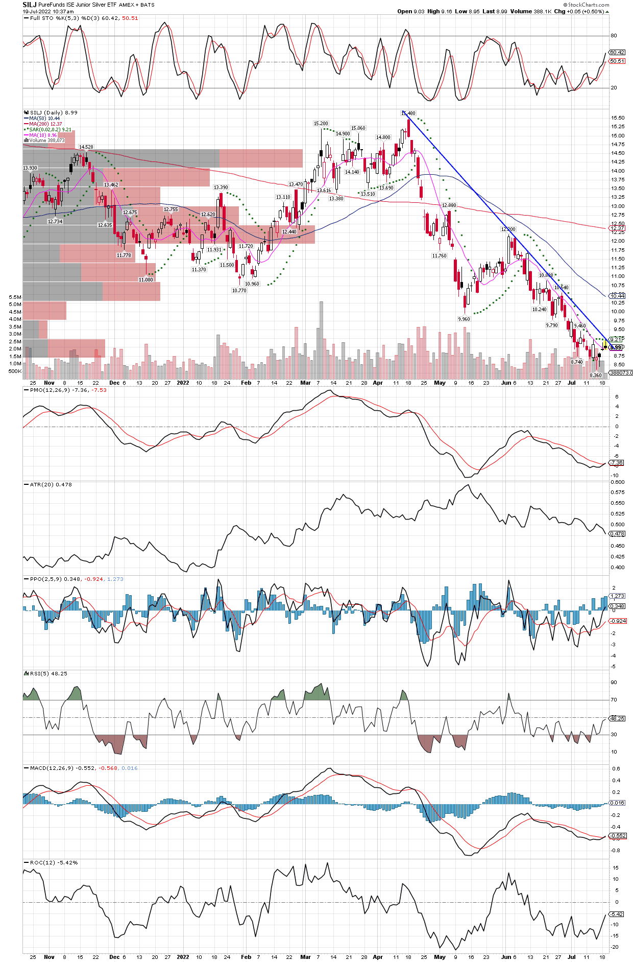
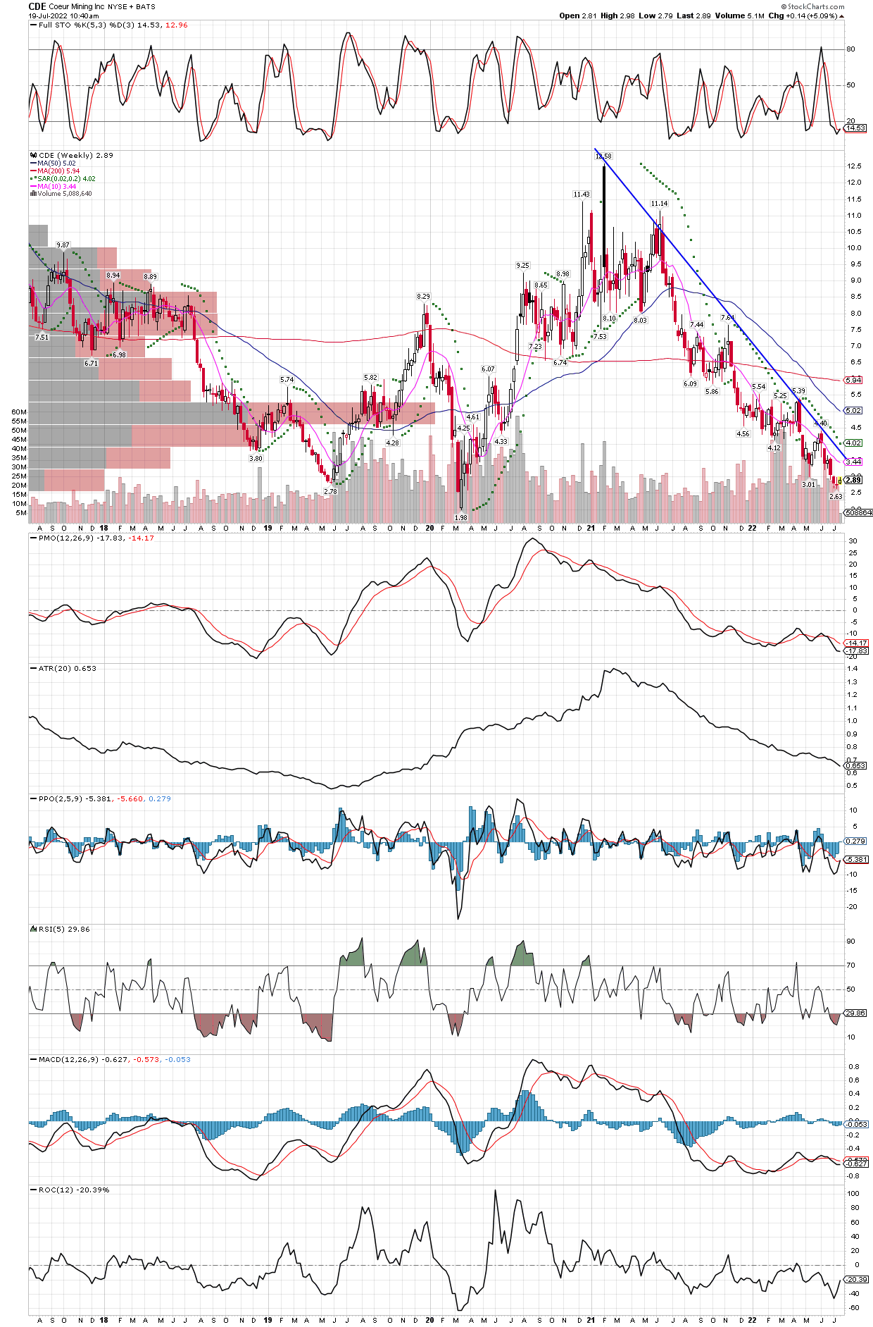
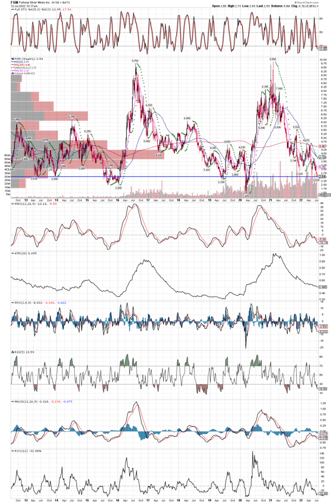
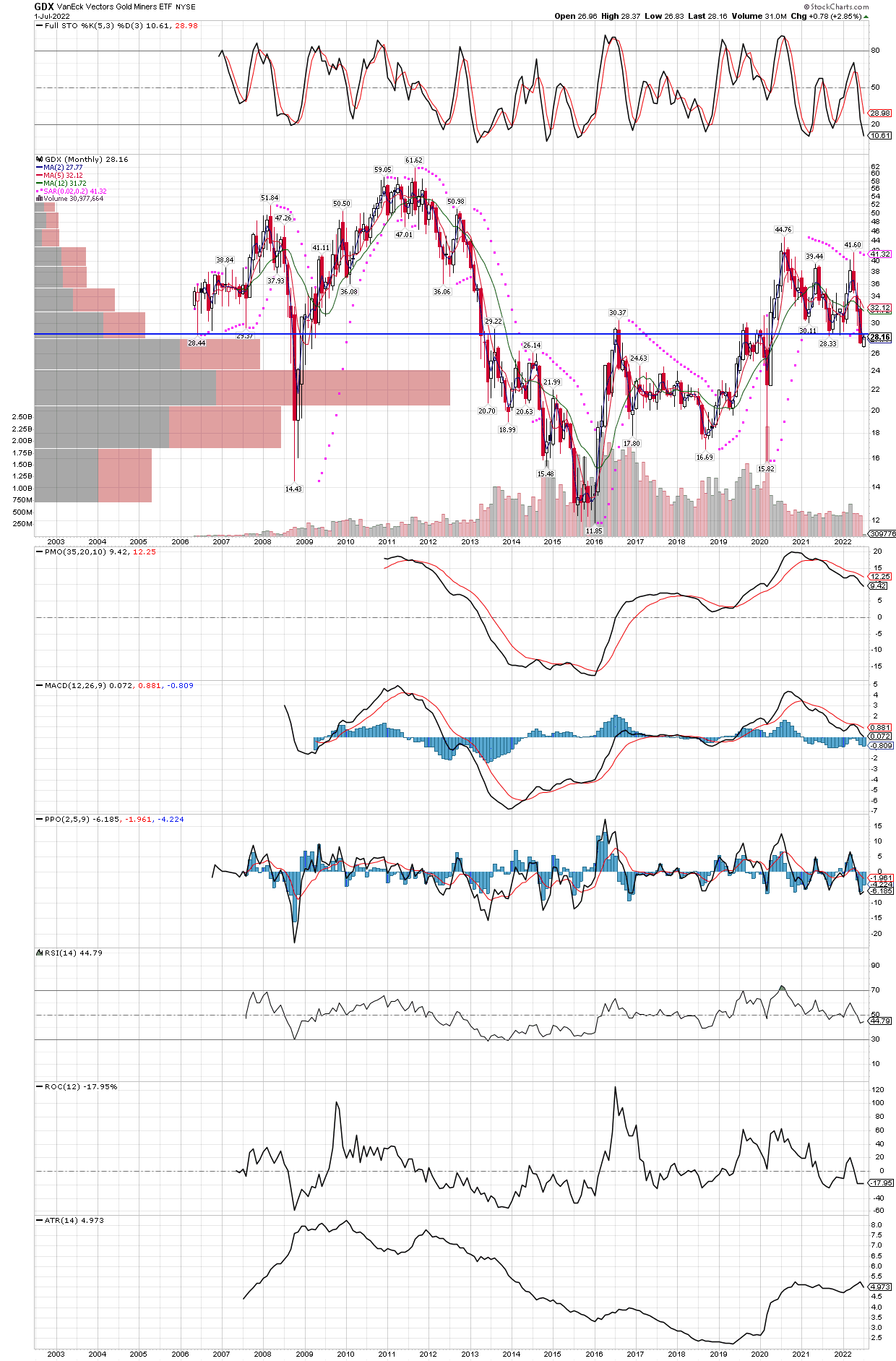
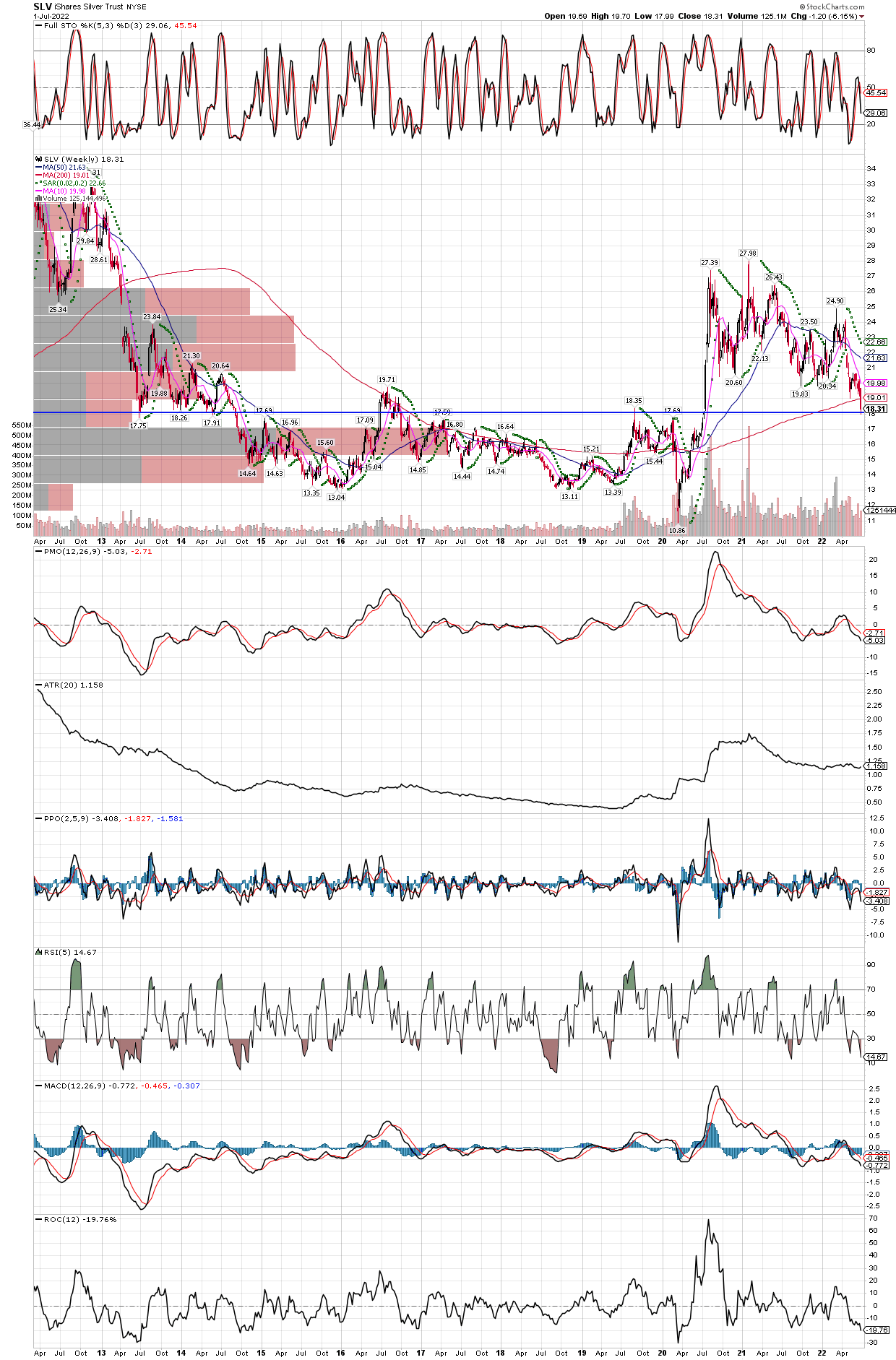
Now that the FOMC announcement is behind us, and the miners acted well in the face on another .75% rate increase, we decided to add to our SILJ holdings this morning on the early dip in the first hour. We didn’t place any trades yesterday, instead just wanted to observe the market’s response to the Fed decision. Several important things occurred this week, including the breaking of many downtrend lines in the group, on their daily charts. Cycles followers also will note we now have confirmed Daily Cycle Lows in place, another good sign the turn higher has begun. Lastly, we are now seeing the stochastics on the weekly charts emerge out of oversold, same with the RSI (5), again suggesting the bounce has begun. Now we have to wait and see how far the move higher can go, and if it can “stick”, that is to say, keep it’s gains. For now, with a new daily cycle confirmed, we should expect 6-10 weeks of generally higher prices in the miners, but if we can get a new Intermediate Cycle confirmed in the group, then we could look for 4-6 months of higher prices. The cycles only suggest the probable direction, how far and fast they move is something we can never know ahead of time. We will continue to look to add into pullbacks, but are likely done buying for this week, as we are loaded up and have already had a decent bounce over the last couple of days. Below is a chart of SILJ showing the broken downtrend line, but just about every mining stock shows a similar pattern.

SILJ DAILY CHART now heading higher, we should expect at least a run to the 200 day MA, as that is also the same area as the 50% Fibonacci retracement level. We will hold all our positions until we get overbought technicals on the weekly charts, at least, which could be anywhere above today’s prices, we don’t just pick lines on the graph to buy or sell support and resistance, we need to see technicals overdone as our first consideration, price level is a secondary consideration.

Added to EQX

Equinox Gold is down roughly 60% in jus the last three months. We added to our position today, ahead of the FOMC announcement this afternoon. Typically, we would wait until after the news is out of the way, but so many miner charts look like the one below, we have to think a low is near, if it isn’t already behind us.

GDX and GDXJ Downtrends About to be Broken?

GDX DAILY CHART
GDXJ DAILY CHART

Added to SILJ and CDE

Below I posted the SILJ daily chart, and the CDE weekly chart going back 5 years, both with their clear downtrend lines from recent highs. One could wait until after the trend line is broken to the upside before buying, but with such drastically oversold technicals, I would rather add to positions here while the stochastics are oversold on the 30 minute bar chart intraday.

SILJ DAILY CHART with downtrend line from the April high.
CDE WEEKLY CHART going back 5 years looks similar, and also oversold on technicals.

A break above these trend lines, combined with technical indicators coming out of oversold and new daily and intermediate cycles , all suggest a bottom is near.

GDX is Down 40% in 3 months

Since the recent high in mid-April, the large-cap miner etf is down over 40%! It’s been painful to hold, but even if they go lower, now is not the time to sell miners as they sit in a strong area of support on the weekly chart, and almost all technical indicators are screaming oversold. We took advantage and added to out GDXU and HL (Hecla mining) positions, and might add some more this morning as the miners closed yesterday’s trading with oversold stochastics on the 30 min bar charts as well. Below are the daily and weekly charts of GDX.

GDX DAILY CHART
GDX WEEKLY CHART going back 10 years

Added to FSM and AG

We added to both Fortuna Silver (FSM) and First Majestic (AG) today, below is the weekly chart of FSM, again looking quite similar to the charts in previous posts, in an another area of possible support.

FSM down to support, this weekly chart goes back 10 years, again showing oversold technicals as well.

Pan American Silver (PAAS)

Another similar chart to the Hecla Mining weekly chart posted yesterday, going back 10 years, suggesting support could be found in the stock somewhere in the current zone.

PAAS weekly chart shows oversold stochastics, RSI, and in a possible support zone.

The Pain Continues…

While prices of miners remain near their 52 week lows, we are adding here and there to such names as Hecla Mining (HL), the largest silver producer in the United States. Last week, Hecla itself took advantage of the weakness, and bought out Alexco Resources for what might end up being a tremendous bargain, as Alexco (AXU) dropped from a high of $3.46 in early 2021, down to a recent price of 40 cents! If the mining executives are buying into this decline, we should be doing the same.

While there are no guarantees in trading, this area on Hecla MiningĀ“s weekly chart going back 10 years suggests the stock could find support soon.

GDX Monthly

I drew a horizontal trend line where GDX could find support, and if it does soon, the recent decline below the trend line would become a classic “false breakdown”. Professionals know that more often than not, support and resistance will hold, so they use these apparent breakdowns and their accompanying higher liquidity to acquire large positions into the panic. The stochastics could go a little lower to be an ideal buy signal, but does not have to being the last rally out of oversold has not yet reached an overbought level, which last occurred in August 2020. The last oversold reading was in early 2021, so the GDX is due for a voyage north, and our bet is that one needs to be in them now, before the move occurs since miners can jump 10% plus in day when they start higher. Waiting just two or three days in that type of turn will really dampen returns if one understands compounding and its effects on a portfolio.

GDX monthly chart, once the PPO prints a positive bar, GDX should be off to the races. Also note this entire correction since the GDX topped out in August 2020, the MACD’s similar correction took place entirely in positive territory, often confirmation of positive underlying fundamentals in the face of a pullback. It could take up to a couple more months to re-ignite the bull, but I would not bet on it, instead we want to be invested ahed of the move.

Silver Weekly Chart Last 10 Years

SLV is not only in an area which should be solid support going way back to 2013, with this decline it has managed to close a small gap created just before the big run in 2020, that started with that breakout in July 2020. It also sports oversold stochastics on the monthly chart, with the PPO indicator starting to contract again. Once the PPO shows a positive bar, silver could be off to the races, considering where it is starting from.

Just think how much has changed since 2013, new uses for silver exploding demand such as solar panels and other green energy project, a sharp increase in the money supply, rapidly rising inflation with a collapse in the bond markets, huge asset bubbles everywhere including all commodities, except silver. That’s right, every commonly traded commodity futures have rocketed higher, taking out their 1980’s inflation-riddled highs, except silver which is still 61% below its all time highs achieved in 1980 and 2011! On that note, we added to our positions late last week, including SILX (2x leveraged etf), FSM, and a few others. Already it is difficult to buy physical silver without paying extraordinary premiums, for example American Silver Eagles are selling at a 50% premium to the spot price of the metal. Once it gets started higher, silver is almost impossible to buy as the move happens quickly. We want to be where the puck is going, not chase where it has already been!

SLV weekly chart going back 10 years, with horizontal trend line. Our bet is the break of the 200 week MA will turn out to be a false breakdown, maybe ushering in a rocket-ride higher.
SLV monthly chart with oversold stochastics, suggesting a turn higher should not be far off.

SIGN UP FOR UPDATES

NO SPAM, EVER!