April 2, 2025
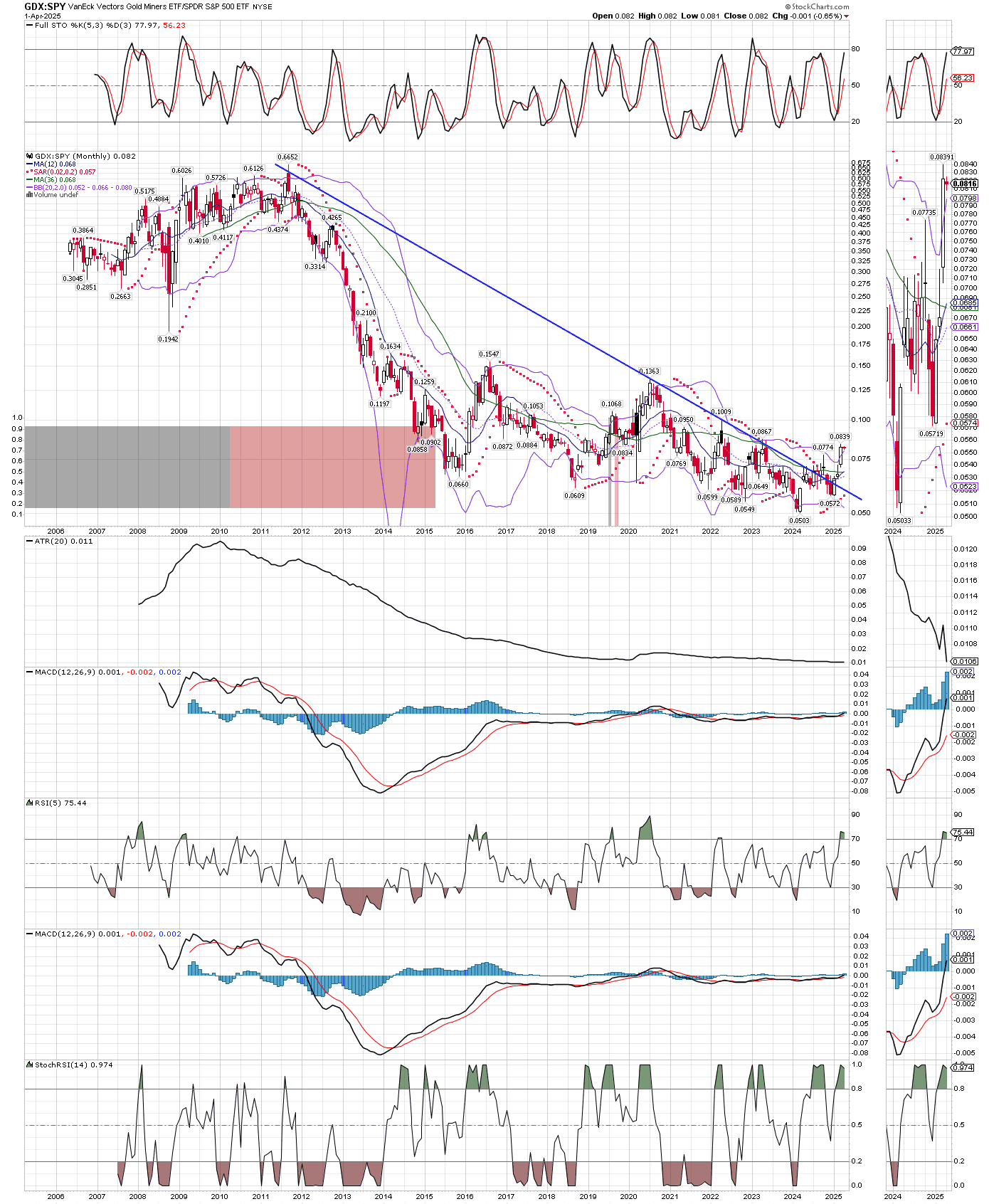
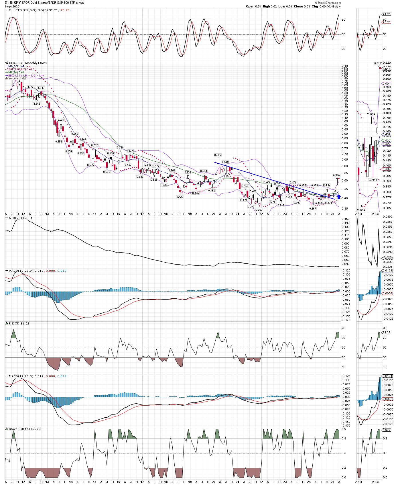
Ratio charts, especially long-term charts like the monthly ones below, often tell us when very significant trend changes have occurred. Money is flowing into gold (GLD) and miners (GDX), and out of the general stock market. Because these charts go back many years, I expect these new trends in favor or precious metals and their miners to continue. Likewise, the stock market could weaken further, but even if all the liquidity (money-printing) they have added to the system keeps the stock market afloat, that just implies even higher prices for metals and miners. I added to a few positions yesterday before the close, like EXK, CDE, GLGDF, JAGGF, and ANPMF.


