Zooming In On the GDX vs. SPY Chart
August 22, 2024
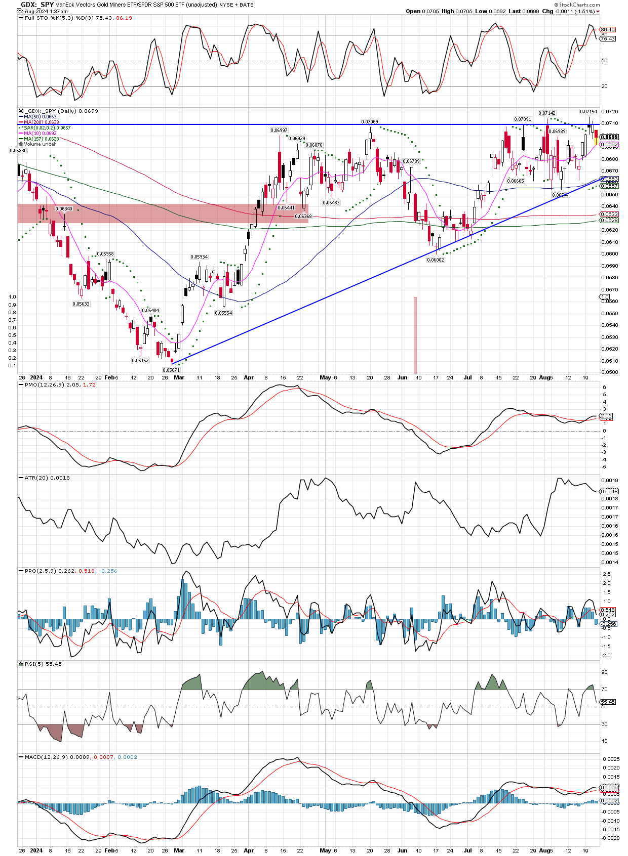
In this post let’s look at the DAILY chart of the GDX vs. SPY. Not only is the ratio in clear uptrend, we can also see it’s trading above all it’s moving averages, which themselves are beginning to turn higher. I put the horizontal trend line on the chart again, and its easier to see how close we are to a real breakout, confirming what the weekly chart suggested, that miners should outperform the general stock market for a long time once solidly over the resistance. The fact the moving averages are all just recently trending higher means we are near the beginning of something big.