More Ratio Charts Showing The Bull Market Is Here
May 31, 2024
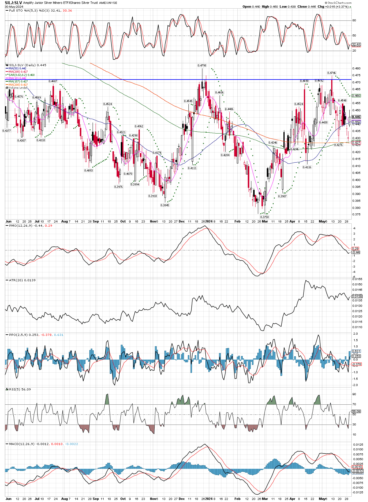
Two ratio charts showing developing trends, the $Silver:$Gold illustrates silver in breaking out vs gold, typically a sign of a precious metals bull market. The second chart is SILJ:SLV, interesting because yesterday silver was down 3.5% all day, while silver miners were in the green all day, finishing up on the day. Normally, one would expect to see silver miners down double the metal, or more, so a 7% down day would not have surprised me, but seeing the strength in miners sufficient to end the day higher, surprised me greatly! The bull is here, buy all dips!
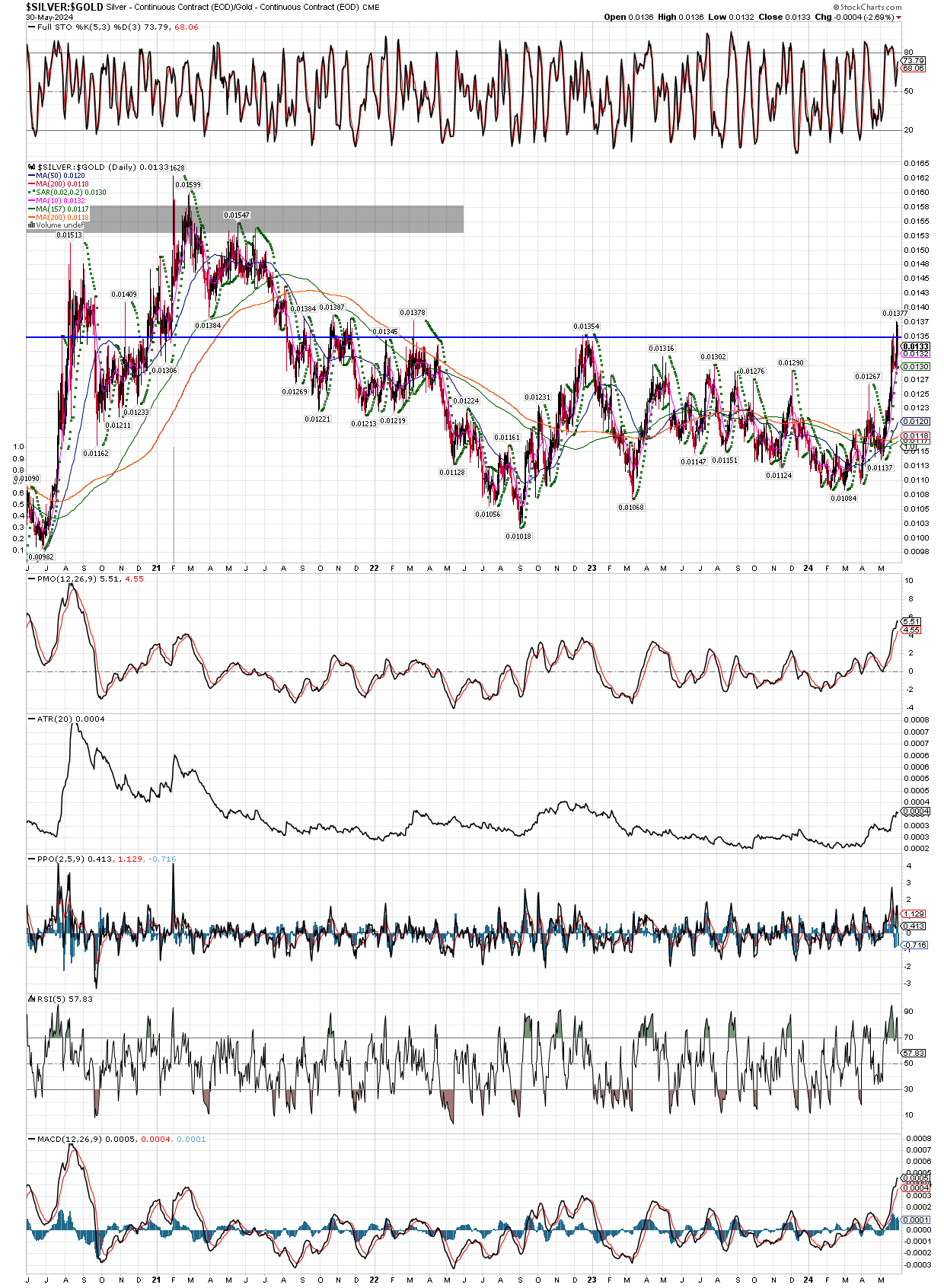
Not only have we seen a recent breakout in silver vs. gold, not the trends in the moving averages in both charts. They have finished going lower and actually are just turning higher, so I expect to see silver and miners to lead gold, while gold also continues its march higher.