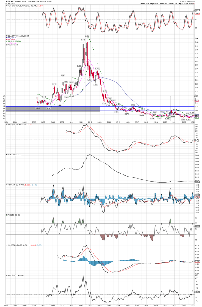
Ratio Chart Comparing SLV to SPY
January 24, 2023
Readers know I like to use ratio charts to gauge relative strength or weakness. It helps to know how one item is performing against another, not just against price, which can be misleading at times. Today I post the long term monthly chart of the SLV etf vs. the SPY etf, that is silver vs. the S&P 500. After a sharp downtrend, the ratio has basically formed a bottom lasting about 9 years. Also note the last great run to all time highs in silver was back in 2011. Back then the ratio started it’s move up from around the .10 level, and continued rising almost 4 years and gaining momentum into the blow off top in 2011. Could we see something similar play out again? I think so, but first lets see the ratio get through the .08 level, then take out the .10 level, after that the real fireworks begin as a longer term bull is confirmed. As I type this morning, the ratio sits at .054, and is already over it’s 10 month moving average at the .05 level. Just a move to the important resistance line at .10 is a double from today’s level, and if the recent move higher from the lows at .041 are any indication of what silver can do, we should buckle up for big gains ahead. The .041 level corresponds to about $16.20 on SLV, and the etf just recently traded as high as $22.54, a gain of 38.9% while the ratio’s recent peak was only .058! One can only imagine where silver will trade in the next few years as the ratio searches for it’s next spike higher.

