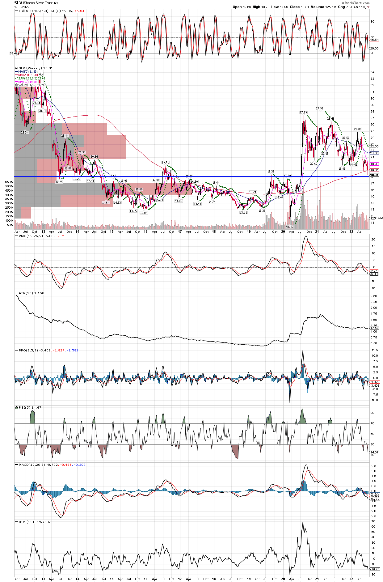
Silver Weekly Chart Last 10 Years
July 2, 2022
SLV is not only in an area which should be solid support going way back to 2013, with this decline it has managed to close a small gap created just before the big run in 2020, that started with that breakout in July 2020. It also sports oversold stochastics on the monthly chart, with the PPO indicator starting to contract again. Once the PPO shows a positive bar, silver could be off to the races, considering where it is starting from.
Just think how much has changed since 2013, new uses for silver exploding demand such as solar panels and other green energy project, a sharp increase in the money supply, rapidly rising inflation with a collapse in the bond markets, huge asset bubbles everywhere including all commodities, except silver. That’s right, every commonly traded commodity futures have rocketed higher, taking out their 1980’s inflation-riddled highs, except silver which is still 61% below its all time highs achieved in 1980 and 2011! On that note, we added to our positions late last week, including SILX (2x leveraged etf), FSM, and a few others. Already it is difficult to buy physical silver without paying extraordinary premiums, for example American Silver Eagles are selling at a 50% premium to the spot price of the metal. Once it gets started higher, silver is almost impossible to buy as the move happens quickly. We want to be where the puck is going, not chase where it has already been!